Celebrating the Blossom of Mindfulness
The Full Moon Festival is approaching and we hope to bring you a taste of cheer as a prelude for autumn. We are happy to work with New Life Psychiatric Rehabilitation Association and CoLab for the new Farmfresh330 on Sharp Street West in Wanchai.
Don't miss the chance to taste the freshest food from local farm and enjoy a moment of mindfulness at the outdoor seat. Support the up-coming newlife330 as well!
Stay tuned with us and more projects are waiting to meet you! Have a good day!
Yours truly,
the One Biters


Year of completion: 2015
Type: branding | retail
Location: Wanchai, Hong Kong
One Biters: Alan Cheung, Sarah Mui, Lung Mak
(Graphics by CoLab)
Celebrating the blossom of mindfulness
New Life Psychiatric Rehabilitation Association is a Hong Kong non-profit organization that provides persons with special needs a safe working environment out in the community. Creating and offering employment opportunities for those with challenges, the association also promotes and provides a healthy and sustainable lifestyle in the form of their shop, Farmfresh330. For this project, One Bite was responsible for the store’s interior and exterior design.
Farmfresh330 goes beyond providing the Hong Kong community with organic foods; though the two concepts are linked, a food item’s organic status does not equate with sustainability. However, Farmfresh330 exclusively sources its organically-certified produce from local farms in Tuen Mun, which creates a sustainable business structure and practice.
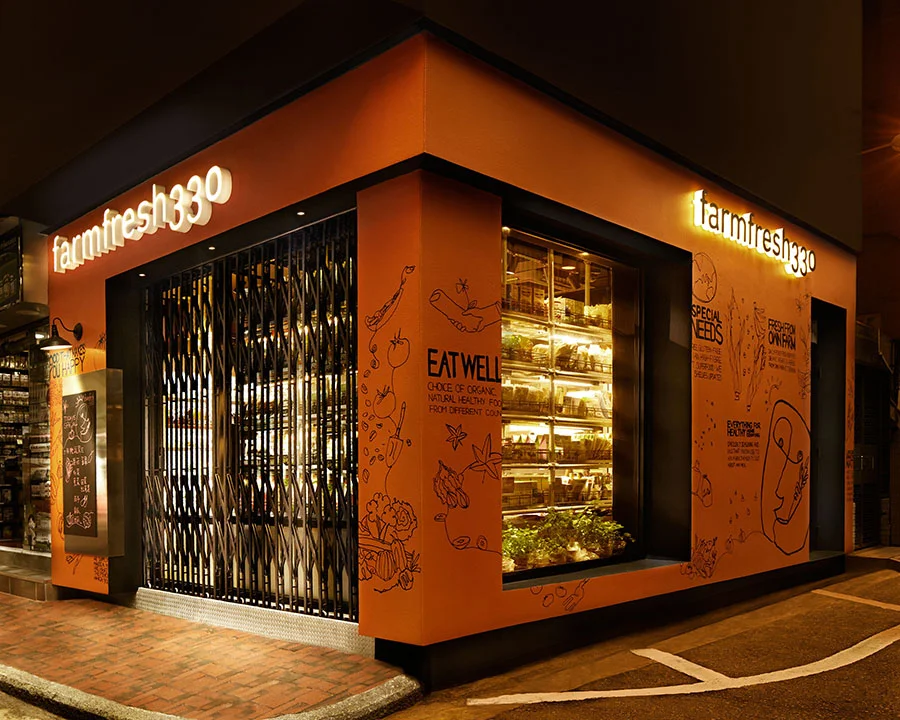
To capture the sunny spirit of the association and to attract customers into the store, One Bite set the facade of the store in an eye-catching shade of orange. Cheerfully idiosyncratic graphics in black dance over the orange textured paint, and provide passersby information about the store and its products. To further the visual impact of the store, the solid black lines of the doors and windows create a sharp contrast against the orange walls. Light-up logos gleam from atop of both of the shop’s two exterior walls, ensuring that the brand’s name has high visibility from all corners of the street. To finish, a galvanized zinc plate with a blackboard center is mounted on the wall beside the main entrance, allowing employees to write down notices and daily specials for customers to see.
Inside the store, the refreshing and clean feel of the farmlands is prevalent. Wood is heavily featured in the interior – a wooden pallet decorated with signage hangs behind cashier’s desks, wooden roll-away drawers lie beneath the center island display and shelves, the zinc-lined product trays on the shelves are accented with timber, and the soft-ash floorboards round off the room. The gentles tones of the wood provide an aesthetic setting for the fresh produce, highlighting the colours and textures of the products. To add visual excitement to the store, dissonance is created in the space with the zinc highlights on the trays and shelves, and with the addition of the L-shaped shelf by the main entrance. This shelf, with each shelf unit individually illuminated with no-heat overhead lights, echoes the rustic exposed pipes found on a farm. The rough, steely colours of the pipes act as an unpredictable complement to the smooth, warm wooden tones of the interior.
Like the rural lands from where the local produce comes from, the design of Farmfresh330 is peaceful and calming, but nevertheless blooms with life and energy.

